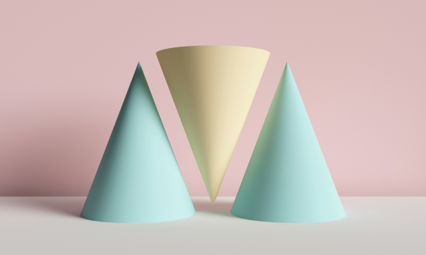
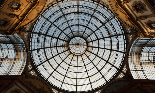
We live in an era where AI is creating artwork. But that does not make traditional artists and designers outdated. Graphic designers and artists still continue to thrive, and some of their conventional methods of creating artwork are more useful now than ever. For example – asymmetrical balance – is one of the key elements of design works and traditional art.
Graphic designers and artists use asymmetrical balance to put life and movement in their artworks. Additionally, you can use your innovative power and skills to create a sense of asymmetry in your design project. Thereby, you will make it more appealing to the eyes.
This article tells you what asymmetrical balance is and what the benefits of this technique in art are. Furthermore, you will learn different tips to use this technique in your work.
Balance Composition Overview

As a designer, one of the foremost aspects that you need to understand is balance and composition. Balance Composition is one of the most seminal visual cues that add character and essence to your work.
In simpler terms, a balanced visual makes people feel comfortable and safe. Our brain is hardwired to recognize immaculate patterns and designs in our daily lives. As a result, an unbalanced design language can make people uncomfortable.
Meanwhile, a balanced image or a visual representation can counter this feeling of aversion and can genuinely help the audience feel more in sync and comfortable. A balanced visual representation actually has soothing abilities.
Symmetry and Asymmetry are two components of the balanced composition. Understanding these is seminal for graphics designers.
Symmetry 101

The first visual concept that you need to understand is the concept of symmetry. Symmetry is one of the oldest and most basic designing languages that everyone knows.
The rule implies that if a line is drawn at the very center of an image, both sides divided by the line should be similar or identical. This is one of the first ever design languages that was created.
Symmetry is broadly categorized into four different variations. These include reflectional, radial, translational, and guide reflectional.
Reflectional Symmetry
The very first variant of symmetry is known as reflectional symmetry. This is one of the most common and straightforward variations of symmetry that is known to designers.
The basic idea behind this variation is that each side of the image looks identical or similar. One of the most common examples of natural reflectional symmetry is a butterfly’s wing.
Radial Symmetry
Radial symmetry is more complex to understand than reflectional symmetry. However, both of them work in a similar manner. Reflection symmetry repeats one pattern once. But radial symmetry does it multiple times.
Radial symmetry works in circles and is heavily used in designs of mandalas, circular badges, etc. Instances of natural radial symmetry are noticed comparatively less than reflectional symmetry.
Translational Symmetry
Translation symmetry is when a specific shape or a pattern is repeated over and over again in close succession. This allows the symmetry to create a textured background.
Translational symmetry is most common in floor designs. Translational symmetry enables designers to highlight a space to make it smaller or bigger. Therefore, translational symmetry is often used as a background for seat covers, floors, etc.
Guide Reflectional Symmetry
Guide reflectional symmetry and reflectional symmetry are often confused as being singular things. These two are similar in several different ways. However, their similarities should not make them identical.
Guide Reflectional symmetry is just reflectional symmetry but is slid off on an axis. Guide reflectional symmetry is reflectional symmetry but in a parallel format. One of the most common examples of guide reflectional symmetry is parallel footprints in the snow.
What Is Asymmetry?

Asymmetry is simply the opposite of symmetry. In this design language, the illustrator is looking to fill their subject with something other than repeating patterns. Instead, they would like to add different elements at the same time.
This is a pervasive design language that was popularly used by Vincent Van Gogh and other people. One of the best examples of understanding Asymmetry is the phenomenon of rock balancing. But the real question is about asymmetrical balance.
What Is Asymmetrical Balance?

Now that we have clarified the basics of symmetry and asymmetry let us dive right in and understand what is Asymmetrical Balance. Artists and designers can create visually appealing and meaningful compositions using different techniques. Composition is key to creating a meaningful piece of art and design. Every design and art project uses a different type of composition skill.
It plays a vital role in a project and helps a creator achieve what they are planning to achieve. In addition, a good design always helps a viewer get the information the artist is willing to relay through the design. It builds a good sense of association and connection between the designer and the viewer.
One of the most essential tools of design is the use of asymmetry and asymmetrical balance. Through asymmetry, an artist can create an asymmetrical balance, making the art or design appear more appealing on the screen.
What does asymmetrical balance mean? It is a balance created by different elements in the canvas. The elements use different shapes, colors, and sizes to form an asymmetrical balance on the screen.
What Are Some Benefits Of Using Asymmetrical Balance?

Symmetry alone cannot make anything look dynamic. This goes for both fine arts and graphic design.
With asymmetrical balance, designs start to look more organic, fluid, and organic. Furthermore, this powerful tool in design makes the viewers focus on certain power and energy distribution throughout. Some of the common benefits of using asymmetrical balance would be just as follows.
Here are some benefits of using asymmetrical balance in a design work –
Adding Visual Variety
Asymmetry is one of the most pleasant varieties in design that creates discord that is pleasing to the eyes. Sometimes, asymmetrical balance can draw the audience’s attention to the design piece.
Asymmetry
Asymmetry in a design works keeps the audience guessing. It makes them feel that there is something in the design that they want to decode. What’s more, through asymmetry, a designer or an artist can boost the storytelling potential of the piece. It can help grow and sustain the audience’s interest.
Creating A Sense Of Movement Through Asymmetrical Balance
Asymmetry boosts the storytelling power of the design. Furthermore, it creates a sense of motion and flow in the design, almost giving life to the design itself.
Asymmetry is a known element that is common in different types of designs and artworks. It can be present in graffiti, graphic design, fine arts, and sculptures. Artists can use the asymmetrical balance in all kinds of design works despite the types of artworks they make.
Use Asymmetrical Balance In Your Visual Content – Tips

Creating balance in an art composition through asymmetrical balance is quite intriguing and interesting. It boosts your creative thought and makes your thought better than what it is. You can let your creative thoughts lose all boundaries and make better art.
Here are some tips for weaving asymmetrical balance in your design works–
Create The Z Pattern
An artist is more thoughtful about how the viewers are going to see their art. A viewer’s eyes have a pattern. They first look at the left part of an artwork. Then, their eye moves to the right follows the movement down to the page, and goes to the right side again.
In simple words, their eyes follow a Z pattern. So, you can try to piece together the elements of the art and form a Z shape to achieve spectacle through asymmetrical balance.
Varying Sizes And Colors
You can start using different sizes of shapes inside the art to achieve asymmetrical balance within the piece. For example, if there is a large colored shape/element in the design, you can contrast it with shapes in different colors and sizes. A mix of varying sizes of elements in the design gives your viewers more variety and reasons to look at it.
The Rule Of Thirds
I personally used to use the rule of thirds while sketching small illustrations. This is a common and most used rule among fine artists and graphic designers. The rule of third requires you to use a grid and come up with nine different squares inside a piece of paper.
You have to use two equally spaced horizontal and vertical lines to use this technique. Now, you can achieve asymmetrical balance by drawing the design elements along those lines or in between their intersections.
Use Contrasting Textures
Design work is not all about filling in a piece of paper or a canvas with color and brushwork. A designer or an artist can use varying types of textures to attract the viewer’s focus in different parts of their work. Sometimes, they use smooth and minimal coloring and textures in some portions of the artwork. At the same time, other portions have more color and varying types of textures.
Balance Between Simple & Complex
A perfect design masterfully includes asymmetry, chaos, balance, and calm. Some portions of the artwork can have a pretty simple approach, while the other portions can be more noisy. A designer/ artist can achieve asymmetrical balance through various simple and complex designs.
Bottom Line
Most popular brands like Apple, National Geographic Magazine, or the Spotify Playlist art have asymmetry in their design. Designers and graphic design firms make captivating designs for products and websites, drawing more prospects to the brand. Most importantly, UI and UX designers would find graphic design more suitable. Hopefully, the tips provided in this article were helpful.
Please let us know if you have any similar queries. Thank you for reading.
Continue Reading:


Leave A Comment